Tuesday 29 December 2015

Jen Davis- Identity

Jen Davis is a Brooklyn based photographer. For the past eleven years she has been working
on a series of Self-Portrait’s dealing with issues regarding beauty, identity, and body image.
She has also been exploring men, as a subject and is interested in investigating the idea
of relationships, both physical and psychological, with the camera.

I really liked how honest her photos where and used them as inspiration when sending off my work to the University for the project Identity. I found her work was shocking and honestly raw and liked the lighting in the images as they are natural and striking.


Thursday 24 December 2015

Identity #2

Below I added my final images and The research I took out.  I wanted to include the pictures I decided not to use to see if it sparked any further inspiration:

I used a tripod that was aimed downwards and a some roses I bought to create these images. The rose is my favorite flower and I really like the images but I prefer the ones I used as my final images. 


Wednesday 23 December 2015

Identity. ‘The fact of being who or what a person or things is’

I recently applied for a University and was given a project for my second level of applying. The theme was identity and we could interpret the work in anyway we wanted. I started looking at the word in different ways and complied a list of ideas I wanted to try and peruse. I also write up a report of my research and my thought process behind it all.

Here is the report I wrote: 

Identity. ‘The fact of being who or what a person or things is’. Is that it? Or is identity more? Do we perceive identity to be more than our genetic makeup? Or do we create our own identity based on our experiences and behavior? These questions have been a strong motivator for this project.

My main aim was to explore what I believe makes me who I am as I wanted to show my true self and contrast it against the different ways I show myself to others. From my knowledge the first photographer who came to mind was Bruno Metra. He uses his images to represent a microcosm which I think is very effective.

I discovered another photographer named Cindy Sherman who looks at identity in a different way. Her series of images is named ‘Self Portrait’. The images use realistic portraits to explore her different personalities. I really felt inspired by these images as opposed to showing different identities through various physical changes she reveals small details about herself a to g as a costume. The costume changes yet we stay the same deep down. These small costumes or identities show how complex our characters really are. I wanted to explore this in my images.
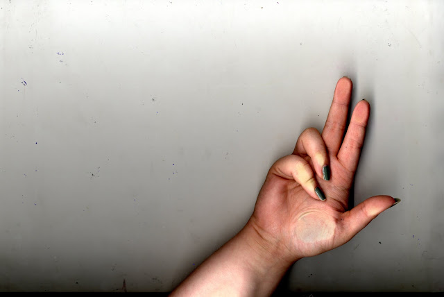
I started to research photographers and artists who explored identity and found Jen Davis on a website named LensCulture.  Her quite brutally honest images explore her true identity. I wanted to incorporate these ideas of my honest identity. Jen Davis’ images really allowed me to explore an honest approach to identity and have me the idea of the images I created. I started by taking portraits yet the way the images were looking I didn't feel like my true self as I had the ability to change my facial expression or edit in post production so I wanted something more honest. I started thinking about other parts of my body that showed my identity. I began thinking about my fingerprints and how they are individual and unique yet I still felt they didn't show my identity that other people around me can see. I then started shooting my hands and the way they tell a story about someone and how they represent me. I felt confident about this as I cannot edit my hands so they are a representation of me. I used my hands to morph random shapes and used the natural pattern of my hands to be in focus.
Alongside my hands I wanted to incorporate the idea of my separate identities. I used childhood toys, favorite objects and things that mean a lot to me. These objects not only show a part of me and my life but also show the various roles have. It shows how even if we feel we are honest with ourselves we know we have multiple identities deep down. I reflect back on the questions I began with and believe I truly explored my identity learning things about myself on the way.

Here are the images: 


Thursday 10 December 2015

Misplace ideas and emotions

Linking with my previous ideas of misplaced ideas and misplaced thoughts from the shoot I did I wanted the model to stand it quite simple positions which were helpful post production. This meant the shoot was quick and very easy. These images were then uploaded to Photoshop and I edited them to multiple the image and repeat itself. This gave the effect of a multiple shot and made the model appear three times. I then lowered the contrast, the brightness and made it lighter generally. This gives it almost a unrealistic effect and makes the audience look closer due to the faintness of the model.
I really like these images as they allow the audience to relate in some away. Sometimes you feel stressed and your own thoughts take over. This means you don't work as effectively and your work isn't as good as it can be. I feel these images express that feeling very well. It isn't an obvious expression of the emotions yet the audience can make of it what they want. 
I didn't really take inspiration anywhere from besides my own feelings showing how confident I am in improvising and creating images on the spot. If I was to re-shoot this I would maybe ask the model to change position to an almost screaming face to show a more deeper emotion yet this was nobody's fault besides my idea not being in my head at the time. 


Sunday 6 December 2015

Misplaced Narrative

I have had the feeling that my work is not taking the right route I wanted as I am not as inspired as I have been previously. I took some images on a shoot and when I looked at the results I was not pleased. I started editing these in relation to some artwork I found. This image really helped me find inspiration again as I never thought of artwork having such an impact on me yet the image is hardly there. Here is my inspired images:


I believe the image tells me a lot about the person within the shot yet the person isn't visible. This lets the audience explore the image for themselves and decided on a story individually. Using the effect of chopping the person out of the frame allows the audience to image a different story every time. This allows the audience to explore a different narrative either multiple per person or varied by person to person. This explored the simplistically shaped image.  Even though this image is simple I really like the effect it has on the model and the audience. 

Tuesday 1 December 2015

Christopher Scott Richey

Photography Series, mixed with Collage and Found Objects
Christopher Scott Richey


I found these images really suited the style of where my images are going. I am looking towards scanning in my images and playing around with the narrative of an image. In doing so I want the audience to re-create a narrative for themselves and let them decided what they want it to mean. This can allow the audience to choose what they believe it to mean.
I like the images as the added smaller images have some small link yet. I want to create these images with my own smaller images to create a different narrative.

Here are some of his images that I really liked:


Monday 30 November 2015

COLUMBIA ROAD: JOHANNA NEURATH

Looking online at one of my favorite websites: Dazed.com I found a photographer who creates very striking images with a plain and simple idea behind them. The photographer looks at a flower market and yet doesn't photograph the stalls of flowers but turns to the gutters to photographer them. These images could be interpreted as a question towards society and whether we need to evaluate what we find beautiful.
The images are very striking as the use of bright colours but the dark gloomy effect of the water show a very stark contrast. This means the colours pop and they become more intriguing.
I feel like the images can link to my coursework or Misplaced as they are in a misplaced area of land.
This has inspired me to look closer at what I'm photographing in future and look closer at the things we don't see. Looking back on these images I feel they look almost romantic in some way and change the way I think of them from when I first saw them.

Here are a few of her images:


Wednesday 18 November 2015

Mixed Media

 Looking for more inspiration I decided to work on some of my own work. I flicked through some photography magazines and wanted to scan in some images. I found the more interesting images and scanned a few in. I was not sure what I wanted to do specifically but I wanted to edit the images in some way to make them different. I scanned in the images and opened them in Photoshop. I then continued to add objects and random things I could find to experiment further.


 This is when I started to experiment. I started with the images in Photoshop and just played around with the Adjustment features.


I wanted to play around with these features and see if I can create an image that was interesting. I played around with the scanned in images and found that the black and white effect made them look unrealistic. This then caused me to begin to think about whether we can create stories from just one image. I began by starting with one of the scanned in images with a simple black and white effect on it. 


This then lead me to think about colour and the way we use colour to tell stories. I had scanned in a toy gun and loved the idea of creating suspense and tension from just merging items together. This lead to a story beginning and a narrative that is made up. I kept adding images together to create a final image with multiple images on top to create this false world. I also used the black and white effect on all the images to give them a realistic look as if they were on the real image to start with. 
Here are some of the images I created: 


Friday 6 November 2015

Misplaced- Claustrophobic thoughts

Claustrophobic thoughts is a project I developed from the word MISPLACED. I used my ideas of our personal thoughts being quite intrusive and secretive. This allowed me to play around with some images without using any inspiration from online. I used the idea of entrapment and being stuck in a place as inspiration and just wanted to play around with my ideas. I used different items of cloth and material to trap the model in. I used these and was not happy with the result here are the ones I was not happy with:


These images are the one that I didn't believe looked that good. I used various materials that ranged in thickness and create different effects. I liked the idea of them but it was not what I was intending. I continued to take images and looking through the 32 that I took I cancelled out the out of focus image and had to remove some due to them being cropped. I ended up with 3 solid final images. I really like how these images have turned out as they remind me of the photographer Arthur Tress who I mist have taken as inspiration unconsciously as they have quite an eerie effect and look like a nightmare similar to his work. I have edit the final images in Photoshop by using different effects and techniques. I used the black and white tool, the grain effect, I sharpened the images and adjusted simple things like brightness, contrast, exposure and other things of the same nature,: Here are the final images:


Wednesday 4 November 2015

Photography Proposal


Photography proposal   Misplace/ment

Through daily life we see arrangement, organisation and order. One of the biggest ideas I wonder about is the opposite. What would life be like if we changed the order of things? What if you could begin to see what life would be like through a different set of eyes? We are so used to seeing order and neat arrangement that the misplacement of  items or objects causes a stir and this is when art can take place. I intend to develop and create a project based on this exact idea. I want to explore the way not only objects can be out of placed but the vast ways humans and animals can feel misplaced. i want to explore not only the well-known photographers but explore other mediums like art, history and literature. This will help me explore the way people interpret misplacement through both humans and objects. I want to look at photographers like Arthur Tress and Lee Jeffries but also more abstract like John Stezaker and Toni Meneguzzo. These photographers have inspired me to develop my own ideas and the biggest inspiration of the idea of reality vs imagination and a change of perception. I want to open up the ideas I already have and discover more during my future work. The word ‘misplace’ I feel will open up lots of ideas and allow me to explore photographers as it can be interpreted in many different ways.

Bibliography

Arthur Tress (2015) in Wikipedia. Available at: https://en.wikipedia.org/wiki/Arthur_Tress (Accessed: 3 November 2015).
Meneguzzo, T. (no date) Toni Meneguzzo. Available at: http://www.tonimeneguzzo.com/holy_cow.html (Accessed: 3 September 2015).
O’Hagan, S. (2014) John Stezaker: ‘Cutting a photograph can feel like cutting through flesh’. Available at: http://www.theguardian.com/artanddesign/australia-culture-blog/2014/mar/27/john-stezaker-sydney-biennale (Accessed: 3 November 2015).
Thornhill, T. (2012) ‘Faces of the forgotten: How haunting portraits of homeless people changed photographer’s view forever’, Daily Mail, .
Citations, Quotes & Annotations

Arthur Tress (2015) in Wikipedia. Available at: https://en.wikipedia.org/wiki/Arthur_Tress (Accessed: 3 November 2015).
(Arthur Tress, 2015)
Meneguzzo, T. (no date) Toni Meneguzzo. Available at: http://www.tonimeneguzzo.com/holy_cow.html (Accessed: 3 September 2015).
(Meneguzzo, no date)
O’Hagan, S. (2014) John Stezaker: ‘Cutting a photograph can feel like cutting through flesh’. Available at: http://www.theguardian.com/artanddesign/australia-culture-blog/2014/mar/27/john-stezaker-sydney-biennale (Accessed: 3 November 2015).
(O’Hagan, 2014)
Thornhill, T. (2012) ‘Faces of the forgotten: How haunting portraits of homeless people changed photographer’s view forever’, Daily Mail, . (Thornhill, 2012)


Thursday 22 October 2015

Sandy Skoglund inspired work- Object misplacement

Whilst researching my work I found this photographer and was really interested in her work. She uses sculptures to create these amazing images that are far from realistic. I was inspired by this and wanted to create something similar. I also felt I needed to refresh myself with Photoshop and use this as a basis. I used Photoshop to edit the images individually then use a highlighting tool to ad the images together. This created the illusion that the image contained lots of small mannequins rather than them being edited together. Overall I am not impressed with this image as it took me a while to create and I don't believe they are of the highest quality as they could be. It did not give me the desired effect and so I am disappointing with this. I know to improve it next time I will use an object that is more realistic and an environment that is more suited. Overall I am not impressed with my result and would try harder and think about it more next time. Here is my final result:


I feel like you can tell the image is inspired by Sandy Skolund yet I feel it looks amateur and unprofessional. I know what I need to do to imrpove. 

Friday 16 October 2015

Photographer #13 Marcela Paniak

Marcela Paniak


I take English Literature as an A-level and one of the texts we are studying is a play named 'A Streetcar named Desire. This play's story does not relate to my photography work and I wont try and force it, but the setting in the play is named Elysian Fields. When I was browsing on the lensculture.com website I came across this. This photographer had explored Elysian Fields in more depth. Elysian Fields is a mythological place where blessed souls of the dead stay. The photographer explained it like this:

"In the underground land of eternal peace and after death happiness the souls which are devoid of all suffering and desires stroll through the pale meadows surrounded by invisible lira music, poplars and asphodels; flowers which symbolize death, grief, sadness, melancholy, sentimentality and eternity. 
These works are carte-de-visite photographs decorated with dried flowers and they show the issue of human mortality, immortality of the images and time passing" 

I really like the idea of taking old picture and using physical objects such as flowers to distort them and recreate the image. Its like we are continuously adding to the persons life and in some way we are linked.

Below I have added a few that I like and want to recreate:


https://www.lensculture.com/search/projects?q=sadness&modal=true&modal_type=project&modal_project_id=42465


Photographer #12 Toni Meneguzzo- Holy Cows

Similar to Michael Somoroff and August Sander who I looked at. Both have removed their backgrounds and then created another within this frame. The way these images have been cropped shows how the same frame can create such a different and strange image. These look very effective and show you how strange things can be once you stand back and analyse the situation,

Here is a quote from the photographer himself about the project and what it includes:

!After making the photograph,  the animals were cropped, making them float on the milky white, to emphasize the artistic work done by the locals on the cows because the surrounding rural and bucolic scenery is so imbued with Indian folk icon to mitigate the stylistic and artistic contributions used to celebrate the perpetual ritual of life and the sanctity of the animal"
.....
"This research led to produce 92 images of holy cows, exploring several Indian states —Tamil Nadu, Karnataka, Andhra Pradesh, Orissa, Uttar, Pradesh, Madhya Pradesh, Assam, Rajasthan — visiting their high-density rural villages to find the cows dressed up for the celebration of Pongal, Wangala, Holi festivals"


Update - Iara Di Stefano Inspired

Iara Di Stefano


Previously I looked at the idea of freezing some text and re-photographing the ice, This creates a really interesting effect and gives you the chance to use text but physically in the image. I wanted to try and freeze some text from on of the most recent books that inspired me. The book is called
  A Million Little Pieces by James Frey 

The book was a random find but I randomly got hold of it and really liked it. The book itself was intended as an autobiographical graphic story of a man who has a very bad drug and alcohol abuse issue and he wanted to get better. He signed up for a trip to a rehabilitation center and the story follows his daily life. In the book he talks about how drug and alcohol abuse is something you chose to do and that it is controlled by you and no-one else.

“Addiction is a decision. An individual wants something, whatever that something is, and makes a decision to get it. Once they have it, they make a decision to take it. If they take it too often, that process of decision making gets out of control, and if it gets far out of control, it becomes an addiction. At that point the decision is a difficult one to make, but it is still a decision. Do I or don't I. Am I going to take or am I not going to waste my life or am I going to say no and try and stay sober and be a decent person. It is a decision. 


This really sparked a thought with me as a concept the thought of alcoholism and drug abuse seems like something that sections you from society and that leads to you feeling misplaced in the world. I continued to read the book with a different mind set and had this photographer in mind. The way the photographer has used text in this way almost explains the book in a picture.

For the photograph I used this quote from the book and simply placed it in a tub in which I had previously frozen some water. Then placing the quote on top I  simply added more water and froze again. The results of my first try didn't come out exactly as I wanted but it has helped me improve my work if I was to repeat it again,

“Unlike most of the other crayons, Black has hardly been used. People probably avoid Black because it isn't considered a happy color [...] I, however, like Black. It is a color that makes me comfortable and the color with which I have the most experience [...] I like Black, goddamnit, and I am going to give it its due.” 
― James Frey


Thursday 15 October 2015

Photographer #11 Ashley Whitt

I was conducting research for another project in one of my other current A-Levels and came across Ashley Whitt. I, at first ,thought I recognized the images but when I looked closer I realized hey were just similar in some way.
This collection of images is called : Sculptural Bookmaking 2010
The images look at books and have shaped them and added things to them to create these images. They have quite a haunting effect about them and I think this is due to the lighting. It creates an eerie atmosphere as some of the book themselves are burnt and frayed. It almost reminds me of the photographer Heidi Kirkpatrick which I looked at HERE 
These photographers are similar in a way that both have the creepy atmosphere that reminds me of haunting memories. I like the way they gives this effect even though the images themselves are quite innocent and don't have any specific scary elements.

I interpret these images as a look into someones mind and a look at their thoughts. This looks like inside someones head as it is quite specific. The way they have been burnt or ripped is in a certain way as if someone has seen it previously. This gives me the idea that the images could represent my word of MISPLACED as they fit nicely with the idea that I had a while ago about misplaced memories and trying to repress them.

This project explores depression and anxiety and here the photographer talks about this project in relation to that:

"The Haunted Mind is a body of work that addresses themes of duality, anxiety, and mortality. When my mother passed away five years ago, I became consumed by depression and anxiety. These images are visual representations of the fears and anxieties that exist within myself. Multiple figures inhabit the frame to depict internal conflicts and the duality that exists within the self. Inspiration for the series comes from literature, film noir, nightmares, and an obsession with death. The images are primarily created in wooded areas and isolated landscapes in order to visually depict the unconscious mind"

The images have a eerie feel similar to the images that I have looked at previously.The black and white effect adds scary effect these images have. Here are a few of my favorite: 


Thursday 8 October 2015

Photographers #8/9- Michael Somoroff and August Sander

I am really getting stuck into the Misplace theme and looking online I found this really interesting set of images. I have come across something similar in the past and really enjoyed it.
These photographers Michael Somoroff and August Sander have used photography in a strange but very effective way. They have taken images of a subject and either doing something or posing for the camera and then simply removed the background to have a plain image. I like the way they look as they really do say a lot even without much in the frame. The lack of subject makes it really interesting and almost quite eerie. The following images are the ones that really caught my eye.

Linking with my theme of Misplaced: I feel these images link as they show a history to whoever is in the images. For example the man in the images may have a story or past and the fact he is not in the images or has disappeared from the images is showing him as a misplaced character . I want to try and recreate these images and see what the outcome is like for experimental purposes:

Photographer #7- Sandy Skoglund

Research brought me to the photographer Sandy Skoglund who is a artist and sculptor and has create these quite abstract and vivid images. She create these bright and colorful images by reproducing an object multiple times within a frame.  This creates the illusion that all the objects are real and altogether create a fascinating image.
I want to try and recreate something similar just to experiment with the camera and see if the results are similar.
I like the way there are people sometimes in the frame as it makes them look like the odd ones out, appose to the strange object that is repeated. I love the idea of these images as they are so unrealistic yet make the people in them look like the ones out of place.