Friday 25 September 2015

Experimental Negatives - Misplace

After contemplating my project word I decided to take a physical look at it and experiment. I've always though when editing my Images that the 'negative' effect always looked either quite cool on certain images or quote stupid on other. I decided I wanted to have a go at creating this style of image. I didn't want to focus on the image content at first so started with simple images. I used a friends fishtank as I've always been fascinated with the fish. I looked at this closer and decided that fish in a way are misplaced. 

The fact we keep fish as pets and almost show them off in transparent bowl is a strange concept. This relates with the negative effect as it's quite an obscure effect to use in photography. I work together with the two and create my first set of experiential images. I used Photoshop to edit the images and just an IPhone 6+ to take the images. I used a simple negative effect, turned up the contrast and rotated the images slightly. 


After editing these images I wasn't pleased with the results so decided to use he natural mirror images of the fishtank to create a natural mirror and again slightly strange effect. Here are the results that I was very pleased with. 


Photographers #6 - John Stezaker

John Stezake

Misplaced


An opposing view of misplaced is the image being digitally edited to become misplaced. One photographer who I have looked at for a while is  John Stezaker. He has used older images to modify them and cause them to become misplaced. His images are strange and alert the audience of a deeper meaning as well as looking quite funny,

Some of his work includes postcards being digitally edited onto older images to show a greater meaning. I like the idea of the items or effect on the images is misplaced and not typically seen in the media or in photography specifically itself.


Photographer #5- Lee Jeffries

Lee Jeffries

Misplacement


After continuing with my research into misplacement in society and the fact homeless people are misplaced in a way. I found a photographer who has done just that. Lee Jeffries looks at homelessness and the less fortunate within a large community. A simple search of his name has brought up a wonderful way of showing all his portraits. They all have a big effect individually but as a whole they are even more striking. 


One of my person favorites is his image of 'Brittany' The image shows flowing lines and high contrasts and that's what really eye catching. I love the way her hair is moving in just the right position and her arm is almost parallel to the hair. I also really like the dirty and grainy effect on these images as well as the super high quality detail in them all.


I really want to use these contrasting and detailed effects if I create similar images. I have the homeless project in mind when I took inspiration from these. 


Photographer #4- Shirin Neshat

Shirin Neshat

Misplace 

Still looking at the word misplace I started to develop my ideas and look outside the box. I have found a photographer who looks at misplacement of people in a different way. 

I am really interested in using some text or experiment with words within my images. This also links with this photographer. The photographer is Shirin Neshat. She is an Iranian Visual artist who lives in New York and is mainly know for her film, video and photography. Her work is very striking at first glace and then starts to underpin a much larger meaning. Most of the images I have taken inspiration from are in the black and white format which looks like a continuous theme throughout my inspiration. Her worked named 'Speechless' looks at using fonts within images. This collection of images is part of a series called “Women of Allah” 

Each photograph that is used in “Women of Allah” has three essential elements: the black veil, a modern weapon, and written text, often disguised, She also has used herself within the images of 'Speechless' which adds depth to the meaning as she feels it on a more personal level. 
I researched this in more depth and found a brilliant analysis of her work and the different aspects of it: 

"The black veil in the Islamic culture symbolizes the compliance of women to their religion and in Iran, it symbolizes the support of the Islamic Revolution. By wearing the black veil in the photograph and having it take up half of the picture, it seems like a struggle between the yearning for freedom and the support of religion. Looking closely at the photograph, written text is also seen on the woman’s face. The written text is actually sacred text in the Islamic religion. By putting it on her face, the body part where people can identify emotions the most, it serves as a reminder of the power that religion has over women and the oppression it has towards free expression. The gun in the picture is another juxtaposition. The woman seems to be embracing the gun as a part of her, giving off a threatening feeling, but at the same time, it does not feel dangerous because of her conflicted emotions: freedom versus oppression."

I want to look closer into using font like this as its on the face in the most personal area. 


Thursday 24 September 2015

Experimental Misplacement #1

Arnaud Jarsaillon and Remy Poncet


I was browsing online and found this photographer who has physically edited the images in a strange way. They have scanned in images in an old format and then also used liquids, foods and other objects to manually edit them. One of my favorite images is the one with an egg on top. This is my favorite because despite the technique, I really like the colours in the image and the way they look modernized. This gives them an updated twist even if the image itself is quite old. I really like how experimental this can be and is quite open to change. It is a good idea to try and recreate in future.

This links with misplacement as not only are the objects misplaced on the image but also it could represent a bigger idea, maybe how the people in the old images have a secret or a bad past.


http://www.brestbrestbrest.fr/index.php?/ongoing/serie-de-collages-en-cours/

Wednesday 23 September 2015

Homelessness and the less fortunate

 One of the way I interpreted the word 'misplaced' was through society and being misplaced in the world. One of the main categories of misplaced people I believe is homeless people. After researching homelessness and looking at some of the statistics here is what I found:


  • Between 1 January and 31 March 2015, local housing authorities received 27,640 applications for housing assistance under the homelessness legislation of the Housing Act 1996 (excluding those who were ineligible, such as recent arrivals to the UK)
  • This is 2 per cent higher than in the corresponding quarter in 2014.
  • For women the most common cause of homelessness is domestic violence (28 per cent)
  • For men it was being kicked out of home by their parents (22 per cent)
  • Being kicked out by parents if the most common reason for homelessness for young people

These facts are shocking to some and yet people are still struggling. A photographer linking with the less fortunate is Richard Avedon. He has a series that I have explored HERE . Not only does he look at the less fortunate he uses opposites to show them in images. In the blog post I talk about how the photographer has used a black and white effect which is typically seen on poverty adverts, charities and other media forms that are for helping the less fortunate.
For example a charity called: Salvation Army. One way this is quite prominent is a simple google search of the word HOMELESS this is what appears.


This search shows how pretty much the majority of images are in the black and white effect. This is what the photographer has used in his images but has changed it slightly to give off a different effect.
Avedon has used this black and white effect but used a more dramatized portrait style for his images. This style shows the images of the people in a more wealthy way. The framing and size of the images does not give off the image that they are less fortunate.

Below is a simple search for a famous portraits just to show how the photographer has mixed both techniques to create the set of images.


Monday 21 September 2015

Gender Misplacment

https://www.lensculture.com/search/projects?q=wrong&modal=true&modal_type=project&modal_project_id=4512

I was browsing another social media and I saw an article about gender misplacement and how some people don't feel normal in their body and want to change. This then made me think and I decided to research this further. I found this collection of images of two people who transitioned from male to female. I love the way the images are taken and the colour in all the images really show the natural aspect of it. This represents the way the people feel in the images. The images don't look touched up or edited in anyway as the photographer has overlooked that and  focused on the main subject, the girls.

I love the way the images are natural and create a really emotional set of images.

Mandy and Eva

Barbie in modern world

https://www.lensculture.com/search/projects?q=literature&modal=true&modal_type=project&modal_project_id=15325


After talking about one of my ideas of using a modern object in a natural landscape I came across this photography project. This photographer has used Barbie as the modern object and placed her in images that make it look like she is using or doing the normal human actions. These images I really like besides the context and conceptual meaning. I also really like the images as in colour, contrast, crop size and other aspects. The lighting in all the images is quite over realistic and quite exaggerated.
 I wanted to do a similar project where I took a modern object for example a blow up toy and place it in a natural environment. This would show the misplacement of the object similar to Barbie in the real work or man made things in nature. I want to complete this still and contrast my images as I will focus on the landscape side of the images rather than the modern world part.

DSLR Misplaced shoot #1

  I decided to look around college for any possible images that link with Misplaced. I took a DSLR Canon camera around my college and found some interesting images. I found some shots to looked better than I thought would and some looked worse than expected. I have added all the images to this blog post but have decided a few of them would look better edited and in a collection. I will add in another blog post to show the development. 


Alcohol Abuse

https://www.lensculture.com/iara-di-stefano


Feeling Misplaced in society when reading a book.

I looked further into misplacement and found that one of the ways someone can become misplaced is through drug or alcohol abuse. This is a way in which you can change from being an average person in society to becoming misplaced and judged in such a harsh way. I began searching for images relating with the word alcohol and misplaced and could not find anything that was suited. I then came across Iara Di Stefano. This photographer straight away captured my attention and I started becoming absorbed in the images.
My own interpretation at the start was something linked with memories and how they can be forgotten or kept in some way. The image of the paper with the thought on it reminded me of how I could link this to misplacement. After taking my own interpretation I looked further into it and found that it was a collect of images from the girls past and she had frozen parts of her thoughts and physically chipped at the certain parts that she wanted. This makes the images unique and original but also shows how personal the whole collection of images is.

I really like the way the images are grainy and have a gloomy effect and really represent the true emotions.

I really want to recreate these images or take inspiration from them for future work.

Thursday 17 September 2015

Photographer #3 Richard Avedon

A completely different look at MISPLACED would be the word from American Photographer Richard Avedon. His work is well known and one of his most famous projects is his American West project. A summery of the project is:
"he focused on everyday working class subjects such as miners soiled in their work clothes, housewives, farmers and drifters on larger-than-life prints instead of a more traditional options with famous public figures"

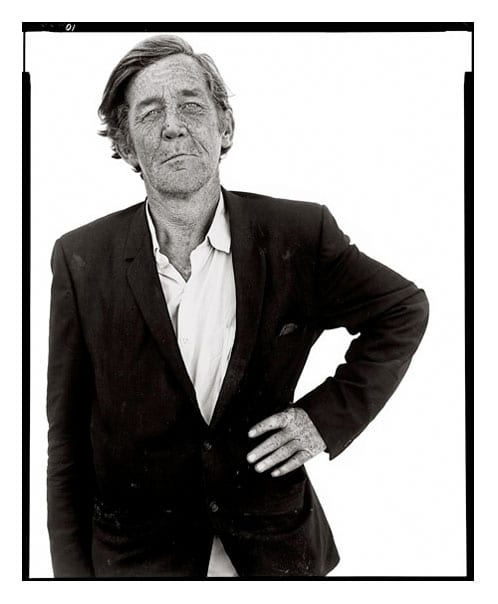
This collection of images really shows the true representation of people in the West. His images are all highly detailed and similar in size and crop. This means all his images are of equality and therefore could be a question on the treatment of these people in society and how they are misplaced due to their wealth and class.  The images are all of a similar framing, the person in the center, to show just them as simple as can be. This draws away any judgment on their actions and the only thing visible is there portrait. Another thing I really like about these images is the fact they are all in black and white. This black and white effect is typically seen when sad emotions are being portrayed or wanting to be portrayed. That means the images in this effect create almost a sadness about the images without any context to the pictures. The black and white effect also adds a grainy effect similar to their cultural lifestyle. It also shows how their personality is quite monotone similar to the images, again forcing the audience to feel certain way.  I also like the way the images are in typical portrait style as this almost idolizes them as if it was a famous person. 

The people in the images as a whole are generally misplaced as they are of the lower class they are not as accepted into society as others who are seen as 'normal' and 'well-off'. This shows misplacement within people in a 'equal' world.  Below are some of the images I found really intriguing: 


Photographer #2 Heidi Kirkpatrick

After being shown Kirkpatrick's work I was instantly drawn to the strange and almost scary objects that has been mixed and placed together in an image. These objects when put together and edited create a completely knew and original image. In some of the images objects such as limbs, scratches, texture and old books have been mixed to create such a mysterious image. I really like these images as not only do they have  a mysterious look but changing the image by adding another object can change the complete meaning of the picture. For example the image below could look at the relationship between the two people on either side, yet once the folded pages are added the meaning completely changes and it becomes more  complex. 

I also like the way the images have a lack of colour to ensure the meaning is on a more complex level rather than relating through colour.  Below are some of the other images that caught my eye and made me look closer. This is a good sign that the photographer has focused closely to detail.