Tuesday, 18 August 2015

Inspiration: Stephen McMennamy

Photographer and creative director Stephen McMennamy has a thing for juxtaposition. He likes merging unlikely combinations of his own images (like ice creams and diggers) as he creates surreal visual pairings, often playing with scale. He has coined these eye-catching pictures #ComboPhotos, and showcases them primarily through Instagram. This shows he can advertise to a not only modern audience but a wider audience as everyone with this social media access. It shows how photographers can reach an audience without having to use exhibitions or other types of big display work. 

I like the way his images are cropped square not only to suit the Instagram social media but the uniform idea of the images. 
This images are also very bright and courful 


General Inspiration

Found on Hungertv.com 
A pop up exhibition of his photographic series Invasion – which explores human interaction and invasion of the environment – will be on show in the piazza to give context to the main sculpture. 
The large, white balloons will be tied together with strands of light which will pulsate, emulating the human heartbeat. It will apparently take 25 people five nights to inflate the balloons. This will also be a unique opportunity for people to see Pétillon’s work in situ, as he usually displays still life photography of the work rather than the actual installations.


Wednesday, 12 August 2015

Taylor Wessing- David Harriman

 The Meadow's Edge 
Truth, Faith and Kitty 

Another image that caught by eye was this one by David Harriman. The image caught my eye at first because it includes the background so I was instantly drawn to the center and that's where the action is. The image also caught my attention because from afar the image I thought contained youths and intrigued me. After looking closer at the image of the two people and a dog i found more information. This image is called 'The meadow's Edge' 
I then found out the image is a some people who recycle and use older materials to create new things. This intrigued me more as the image is styled like a you her image and something with more immaturity yet the image holds so muc context. I really liked this image as it generously caught my attention and got more interesting the more I read about it. 

Taylor Wessing- Jill Hoover


Say hello to my little friend 

I found this specific image to catch my eye for to great love of animals. It drew me in with the dog and then I began to look closer into it. I found that the series is full of image of dogs that have a bad name because of their breed. This speaks to me on a person level as I have a dog that has a reputation yet go against this with my dogs personalty. I not only liked and enjoyed the series idea but love the image. It shows the bond between dog and man, as best friends. The dog and man are both lookin at the camera and make it a special image. I also found the simplicity of it explains the dogs problem. With it being labelled as a 'bad dog' the simplest image can portray a 'good dog' and make you think. I also feel it's portrays the owners personality as he looks to be strong and powerful and almost protective of his dog. The dog's stance also shows trust and him leaving on his owner makes the dog look a little
More bunerable compared to it's typical bad reputation. 


With a mis read name I cannot unfortunately research the photogroaher after trying but really wanted to explore the other images and how they are portrayed. 

Taylor Wessing Photography Prize

After finding an exibition in the winter gardens I looked inside and found a numerous amount of inspiration. I looked at all the images in the exibition and liked all of them
 I of course, had my own personal favourites and was instantly drawn to them. 
The exibition itself was lighted perfectly as the limited light have it a more detailed effect and meant you had to look closer to find details. The images were all backed on white board or blue board to draw your eye and engage you like this 

From looking at all the images a wide theme spread across them all yet they all had multiple individual themes arting from depth to family to animals and action. I searched and spent my time looking at all the individual images. Some images were larger than others and some were smaller. Both had a dramatic effect and both were just as interesting. I loved the exibition and found new photographer who I have researched and found more about. 

Other exibition review from the Telegraph say: 

A fine swansong for outgoing director Sandy Nairne, delivering portraits that are variously elegant, jubilant and unsettling, says Christian House


Overall the exibition showed a great variety of portraits and all photographers showed skill and meaning. I have analysed some photographers specifically in more depth to show my interest 

Summer project- This is where we are


Looking gain at the sky and how people don't take as much notice as they should. I took a real liking to the square cropped image on my camera phone and found the images looked very good. I like the way the clouds hide behind them and both the trees shape and the clouds shape are mirrored. I used my camera phone to create more of an outline rather than a super detailed image of the bark for example. Here are some of the images followed by my favourite image: 


This image I believe to be the best one as it mirros the trees and shows how beautiful nature can be: 


Summer project- inspiration #1

One of my biggest inspirations is Martin Parr. He creates beautiful images using colour and depth to show every day life yet in a form of art. The images are of typical day scenes yet show character and a lot of the peoples personality. I took inspiration from his everyday images and here are a few of my favourite: 


Evaluation of summer project

From looking through inspiration and looking at my own images I found I was pleased with most of my work. 
If I could re-do my summer project I would: 
-travel more. I feel my images would have been more adventurous if I had travelled to see different sights. It shows in my work 
-I would have looked at the smaller detail in sheffield that nobody noticed. I would have liked to complete a little project of small details around sheffield
-I would have edited my images slightly more to add more depth to them 

I feel there are some positives in my work including:

-I feel I used a variety of smaller themes inside the large theme, This is where we are. This means I don't have 1 collection of landscape images but more variety. 
-I didn't want to take pictures of the typical things such as landscapes and cityscapes so thought outside the box. 
-I feel I took on the challenge of I ding uniqueness in my images especially the smaller theme of the images of the sky. 

Overall I feel proud of the images I took yet know there could be improvements like any area of work. I really enjoyed this and know how to improve in future. I really liked looking I to sheffield and finding images like the ones I have. 

Summer project- This is where we are


From my previous blog post I looked closer and thought more about a place we all see or experience daily and wanted to create some realistic images. I decided the images from on a moving bus created a natural frame and made the images look a lot more professional than intended. Here are a few I decided were the best: 

Summer project- This is where we are


From reviewing this project I was excited as the theme is so general and opens so many doors for photogrpahy. It allows me to explore the place I live, sheffield and also share it will the viewer. Sheffield y a glance I do not believe to me as exciting as other places yet when I began this project I realised it was just as interesting. I feel I have explored sheffield.

I started this project by lookin at sheffield at a whole and wanted to explore the bigger picture. I wanted to show sheffield as a whole picture without takin away the small details sheffield is none for. I began by a simple shot of the city from a viewing area close to my house. 

I wanted to show sheffield how it's typically seen as an industrial city yet how a piece of the nature just in front can alert the audience of where thy really live. 

Following this I wanted to start looking y nature and the smaller side of sheffield and pay more attention to detail. This helped as it showed me and the future viewer that sheffield has it's delicate nature in comparison to the industrial steel work. I used my phone camera for the following images just to show you how the detail can be seen I everyday life and there's no need for you to search. I used the black and white filter on some images to strip the image of colour and focus on the intense detail that sets up the image. 


I then started thinking about the amount of nature in sheffield in comparison to the city and though about an even bigger picture, the sky. The sky is in every area of the world yet not many people stop to look enough. I thought to use the sky as a main focus and use shadows and crisp quality images to show sheffield. Below are some of my favourite images that I believe show exactly where I am. 


Following on from this, I found some great images from the sky on this perticular day. I've added them all to show my process. 

Tuesday, 11 August 2015

Street Photography- Train Station

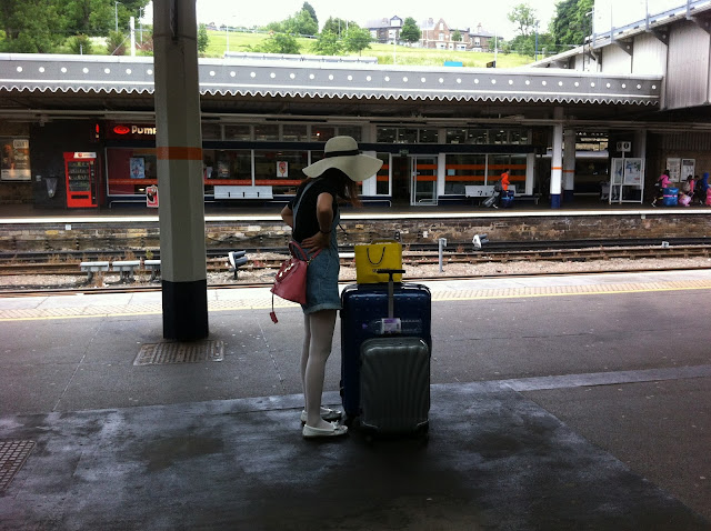
Following up my previous street photography we were asked to meet up and look inside the Sheffield train station at a little more energetic atmosphere to see how the images looked. I found this environment really opening as it allowed me to watch people pass by and create stories and situations in my head. This meant I found more interesting things to photograph. Some images came out really good and others not too good which is just the way taking photographs in a busy place like a train station turns out,

I personally loved the colour of the train station and the way everything it always in a rush. This meant it was a really challenge to make sure I created the images quickly before they passed. The way the train station is set out also allowed me to play with lines and parallels as the long  platforms worked perfectly well in images. Below I have added the plain images that stood out for me and made me proud to have taken:


 This image represents the process of taking the image as I had to prepare my image and create a starting point. Through the next few images you can see the image coming together and looking more professional.


This image I felt looked more put together and worked better once the woman had put her hands on her hips.