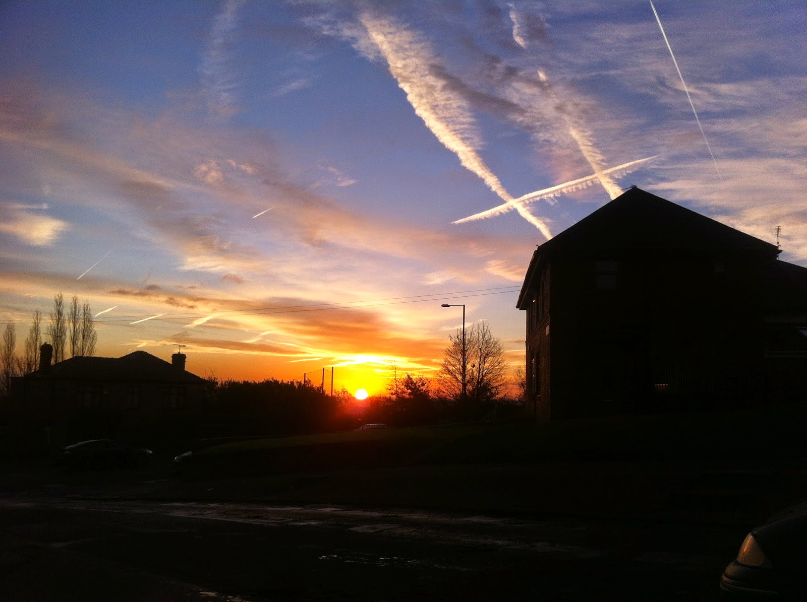
Using the rule of three I wanted to show how this technique can be applied to ensure the images I produce look professional. The rule of three involves splitting your camera screen/view finder into a grid which can be used to split the image up. The rule of three either splits your image up into horizontal or portrait grids. These can be used to show 2/3's sky and 1/3 foreground (or the opposite) to ensure the image is spaced out and looks more presentable.
Here is a couple of images I researched that used the rule of three.
Here is an example of one of my own pictures that uses the rule of thirds to create a spaced out image:


No comments:
Post a Comment