Thursday, 17 September 2015

Burning Man Festival

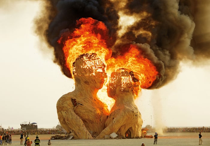
From general knowledge and research I remembered a festival called ' The Burning Man Festival. The festival takes part in Black Rock Desert in Nevada. The festival involves the lighting of a huge masculine figure made of flammable material such as wood and cloth. I have been a fan of the photography from the festival for a while but only recently looked closer into it. Some photographers make it their aim to create fantastic images from the festival and the results are as expected. Because the festival involved lighting a man on fire, it does produce some very high quality shots and also some shots that are surprising in quality and detail. 
I decided to research this further as I noticed a lot of photographers using this as the perfect opportunities for pictures.  This also links with my current exam as the word 'Misplaced' can be see throughout the festival. The general fact that the festival is in  Black Rock Desert in Nevada is generally shocking as it is not expected in a Desert. This is also strange as the festival full of fire is quite a random and bizarre idea in the middle of nowhere. I decided to look closer into the festival and see how some of the photographers interpreted this festival. 


One of the photographers I found was Kevan Christiaens. Kevan is a photographer I found on the website Hunger.com. I have seen his work before on the website. His images are very striking and stunning due to the wide angle lens he uses and the angle he takes the images. He walks round the festival and takes images of the general festival that will create pieces of art. Below are some of the examples of his with the correct angle: 


This links with my project as the whole idea of the festival is misplaced in the Desert. It almost seems surreal having a festival in the Desert. I really like this angle the photographer has used to show a wide angle. 

In my own project I want to look into modernized ideas or objects being misplaced in society or a different environment. I want to try and recreate this idea of something as big as this festival being misplaced in the world. 

Tuesday, 15 September 2015

Choosing my Project name

From thinking more about my project I decided to develop the word 'harmony' and looking into the actual definition of it. After searching through different words I thought I'd settle of the word MISPLACED. This word I feel opens up many ways to look at the word.


I found the definition to be:

misplaced
mɪsˈpleɪst/
adjective
  1. 1.
    incorrectly positioned.
    "a million dollars had been lost because of a misplaced comma"
  2. 2.
    temporarily lost.
    "her misplaced keys"
     
    synonyms:lost, mislaid, missing, nowhere to be found
    "her misplaced keys"


I then went on to mindmap again this time with the word 'Misplaced' in mind. I produced a number of mindmaps. I also scribbled down notes and simple ideas that I could add to the mind map. Below are some of the mindmaps I created with my ideas:


I can then add to these mind maps and see how my ideas evolve.

I look forwards to finding out some basic inspiration from this word.


Photographer #1 Hannah Guy

Hannah Guy is a photographer I also found on LENSCULTURE who's images I really enjoyed. Her images involve multiple images added together to create a beautiful image of the tree in 360 view. This is a nice technique to show emotion as the black and white and the multiple exposure technique almost make the image quite sorrowful.
I also like the way the image is quite simple yet because the multiple images in one it still has quite a lot of detail in it. This means the audience is more intrigued to look and notice what Guy has done.


https://www.lensculture.com/articles/hannah-guy-staccato-and-north-south-east-west#slide-3

Sunday, 13 September 2015

Tranquil Research

I first thought the first place to look for original research would be Lens Culture. I looked online and did a simple search online to see what appeared.  The word 'Tranquil' showed up this photography and her work.

https://www.lensculture.com/search/projects?q=tranquil&modal=true&modal_type=project&modal_project_id=147533

I really like her work as the images truly represent what people originally think of tranquil. This is what typical images of tranquil represent. I really like the way her images have a mysterious feel with as the mist and toned down colours create a eerie effect. Here are two of my favourites:

Tranquil forest


I really like the toned down colours as I said before as the purple/pink mist in the second images has visual connotations of a different world therefore creating a fairytale like feeling. This links with the word tranquil as its represented with an enchanted feel for something peaceful and dream like.

I also like the layers of trees in almost all of her images. She has composed the pictures in such a way that it looks almost unnatural for the trees to be in rows and look so aesthetically pleasing. This is something I should try in my work by using lines and rows to create images.


Inspiration #2

And All the Spaces in Between


After taking up anothet search on lens culture into tranquil I found another photographer by the name Linda Plunkett. Plunkett has also used the word tranquil to its typical image yet the images as a whole look really pleasing. I like the way the images are quite an image in a collection. This also maks the colour of the white background in all images stand out. It really draws the audience to look closer and feel the true meaning of tranquil.


I really want my final project to also have this quality. I want my images as a whole to look aesthetically pleasing together. This is something I want to look at in more depth in another blog post which I will link HERE.


Saturday, 12 September 2015

Start of my A-Level Project

After receiving my new project we were that our second year was entirely independent based.This means all our thoughts and work is entirely ours. To start off with the project I decided to look at what I was mainly either a) interested in or b) what I had a passion for. I decided I wanted to create a project leaning towards a more conceptual project similar to my exam in my first year of Photography. This as a starting point in class our Tutor Andy gave us a starting work that was randomly drawn from a hat. I got the word 'Harmony' which at first I thought I would struggle with as it is quite an obvious work and therefore was harder to think outside of the box. I mind-mapped a few ideas and we were taught how to make links between ideas.


This helped me see a bigger picture to whatever I wanted to do. I helped me think more about the word in itself rather than a straightforward idea for a project. This is where I didn't want to confuse myself and choose a word that was difficult to start with so had another thought about the word I could use. I really feel passinate about nature and landscape photography so was leaning to the idea of something more conceptual and more easier to look at from different directions and opinions. I am yet to choose a word that I feel I can develop in as much detail as needed. After this picture was taken I then went on to expand my mind map and add onto the information I already had.

I then once I kept this word in mind for a couple of days I decided another word may suit me better. I looked at other words such as 'tranquil' and 'peaceful'. I decided that none of these suited me.


I will continue to search for a word that suits me and I feel I can develop further.

Photography Supporting Work


Friday, 11 September 2015

2nd Year Photography

After completing my summer project and receiving my grades I really was hopeful for the second year. I recorded. I got a grade A in both my exam and coursework and was very proud with myself. I believe I worked hard and deserved my grade yet want to strive even further and aim for a A*. I look forwards to hearing from my tutor Andy Dolan for my future projects.  

First signs of Autumn

Walking home from college I found an opportunity to take pictures representing Autumn. This is one of the first visual signs Autumn in near and Autumn as a whole is very good for photography. I find that the orange leaves create lovely images and look great as a group of images. Below I have added the original image and a slightly edited image. I really like how the images would look in a collection so would love to add to these images. 

To be continued: 

Tuesday, 8 September 2015

Independent 2nd Year

Today I was told my next project is independently based. I have to complete another exam and coursework yet this time I do not have the main guidance from my tutors. In this we are told we have to fully explore a word and look at it from all possibilities.  I feel very confident about this exam as I feel it helped me working last year quite independently anyway. This year I aim to not only explore the word I choose, but also look at it from different perspectives. This means looking at different definitions possibly and looking at how different people explore this word.

Tuesday, 18 August 2015

Inspiration: Stephen McMennamy

Photographer and creative director Stephen McMennamy has a thing for juxtaposition. He likes merging unlikely combinations of his own images (like ice creams and diggers) as he creates surreal visual pairings, often playing with scale. He has coined these eye-catching pictures #ComboPhotos, and showcases them primarily through Instagram. This shows he can advertise to a not only modern audience but a wider audience as everyone with this social media access. It shows how photographers can reach an audience without having to use exhibitions or other types of big display work. 

I like the way his images are cropped square not only to suit the Instagram social media but the uniform idea of the images. 
This images are also very bright and courful